
.png)

How might we make the website more engaging for teenagers and young adults?
How might we optimize the website flow for different audiences, i.e., young participants and the wide public(with a focus for researchers)?
Primarily, each of the team member test the website by ourselves and list out a few issues. We then analyze the structure of the website. Our competitors include: Respondent(https://get.respondent.io), User Interview(https://www.userinterviews.com/), and other youth-engaging websites.
Meanwhile, we searched for best practices for website design with a focus on young users.
Key Findings:
For the recruitment websites, they usually have a clear path from start to user participation; but in MyVoice, the path is too long and process/incentives are not clear.
In terms of whether the website is engaging for the youth, we find that websites may have stereotypes towards teens' preferences, such as too many interactions. Referring to best practices, we consider Flat Design system, straightforward info presentation, and designing a mobile view.
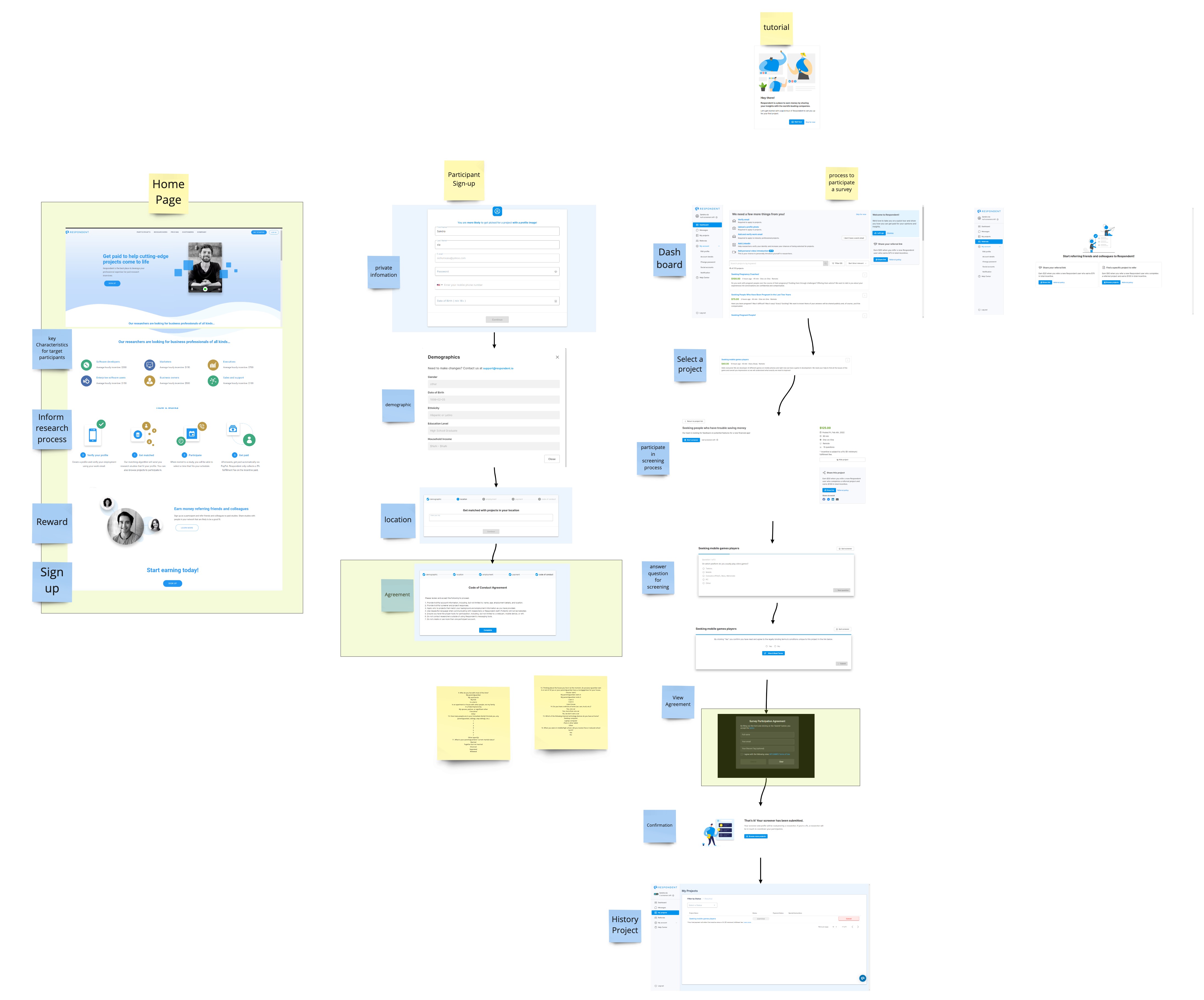
Interaction Map for Respondent
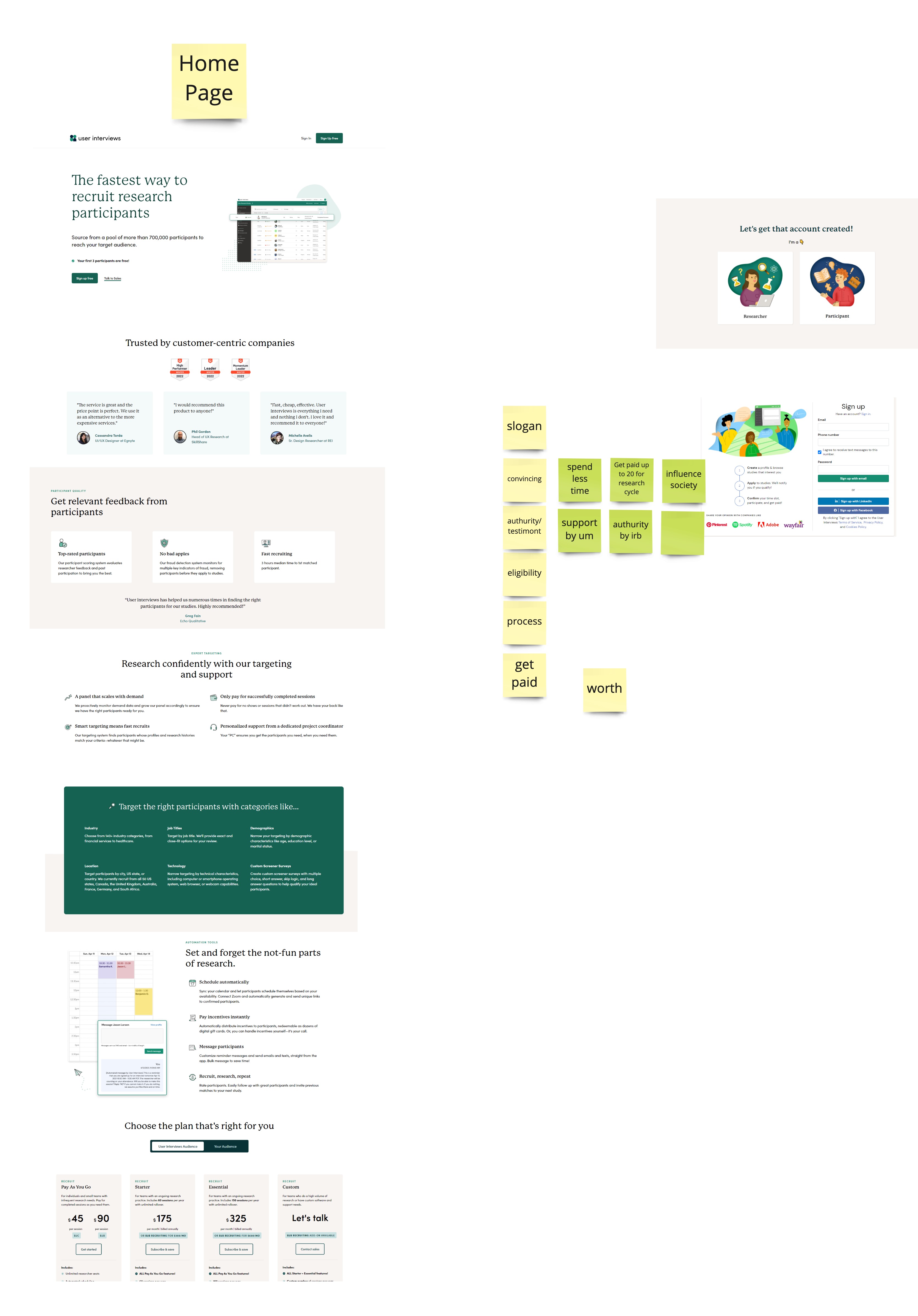
Interaction Map for User Interview
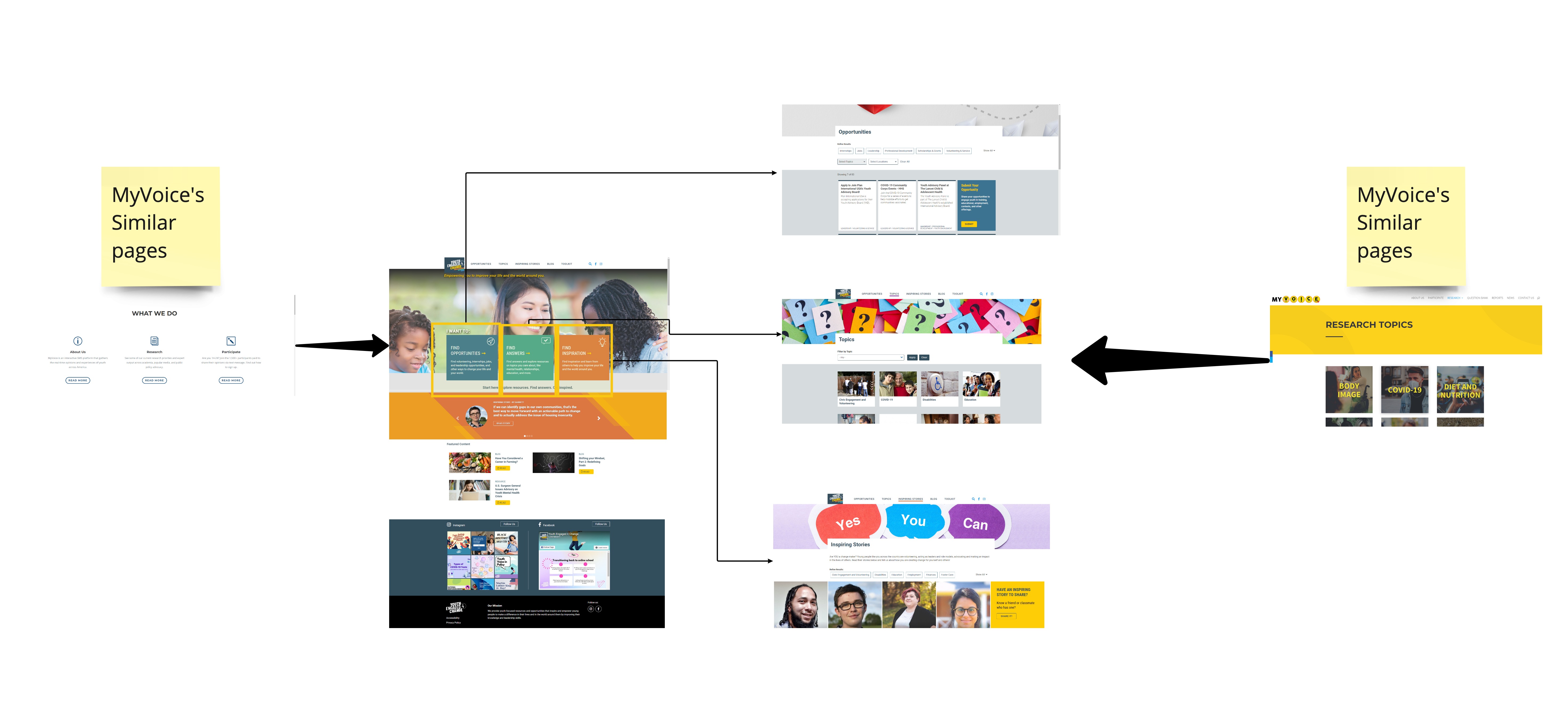

Interaction Map for Youth Engaged Change
Interaction Map for MyVoice
We first designed the survey questions, aiming to uncover the user demographics and preferences/goals about website usage. Key questions, apart form user demographics, include:
Do you often open a website on your desktop device/mobile phone/tablet?
What are your goals using MyVoice? What features are you most satisfied/find most difficult with?(for old user)
Are you more likely to open a website if your school/parent/friends introduce it to you?(for new user)

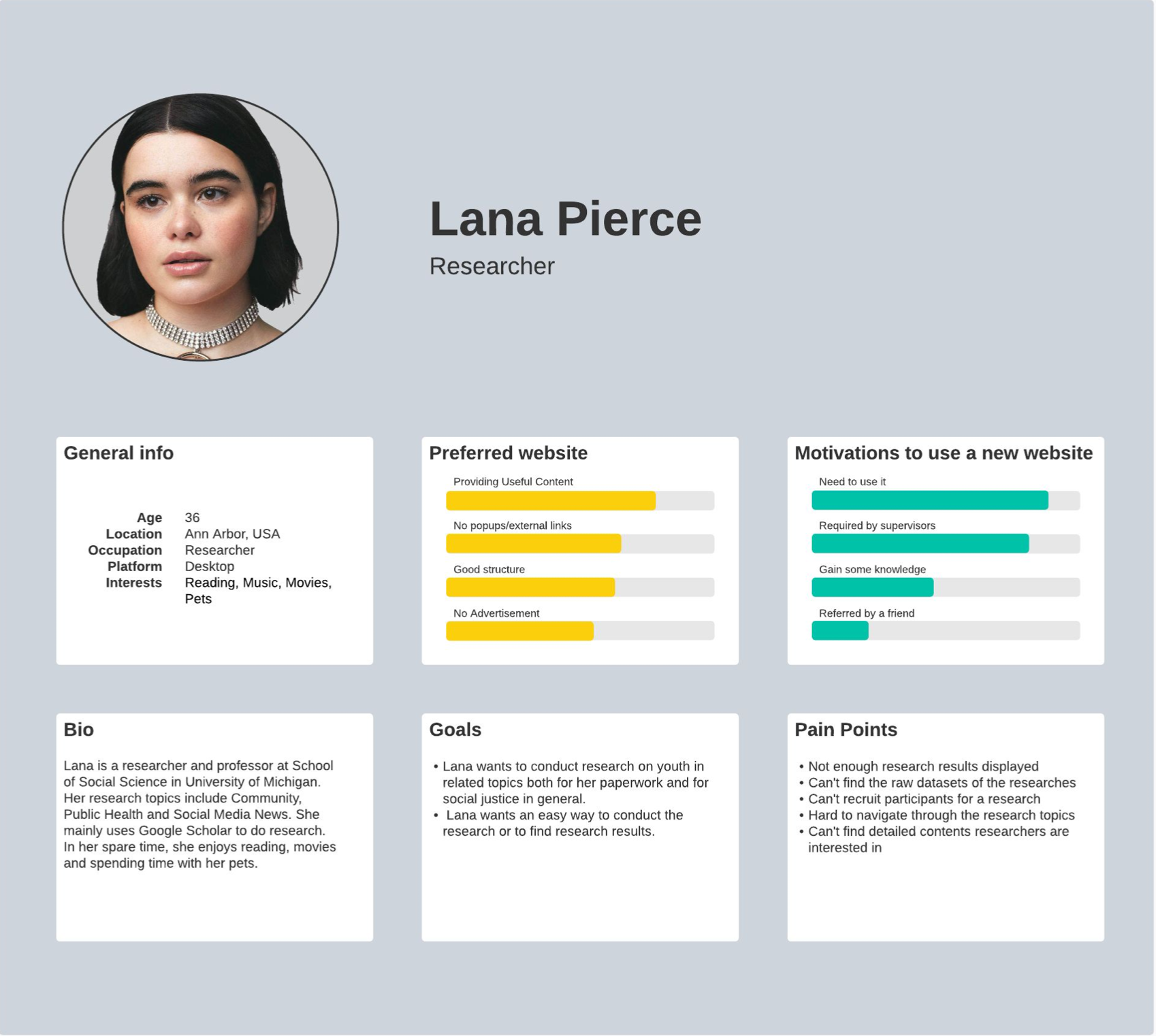
We divided users into young people/researcher and new user/older user groups and recruited at least 1 for each user group for our semi-structured user interviews (and following usability tests).
Interview Quote Example:
"I assume MyVoice wants to work with researchers? Can I customize the questions, or narrow down demographic?"
Key Findings:
For new users, they prefer to be referred to use the website and prioritize the ease of use.
For researchers and old users, they are more interested in data, results and methods.
Most users would like the website to have a clearer and more descriptive information hierarchy or guidance.
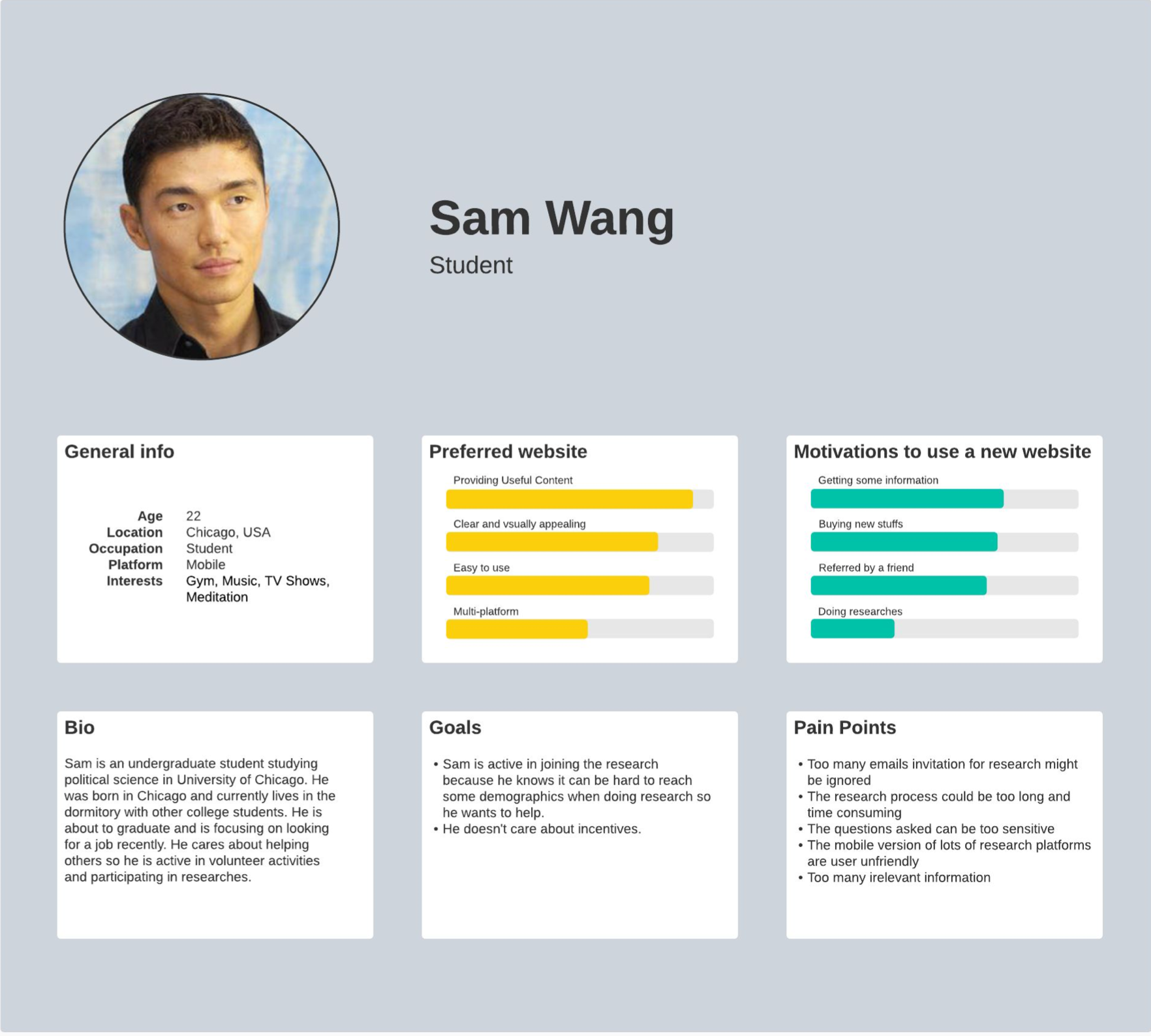
Persona 1: Young people
Persona 2: Researcher
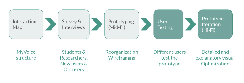
Based on our previous findings, we made a mid-fidelity prototype to reorganize the information hierarchy in wireframes in MyVoice. We used this prototype to conduct our usability testing.

Key Findings:
The navigation bar should be redesigned for better information hierarchy
The information architecture of some pages are problematic
Users have problems understanding and distinguishing different pages
1. Redesign navigation bar to match user mental model with better information hierarchy to be more efficient
2. Participate and Home page needs to be better visualized for improved readability
3. Redesign individual page headings and layout for a more visually distinct look
4. Add breadcrumb and question icon on each page
5. Based on youth's preference to be referred and tech usage habits, design a mobile prototype.
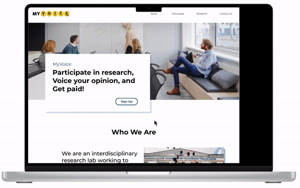
 Click to try web prototype
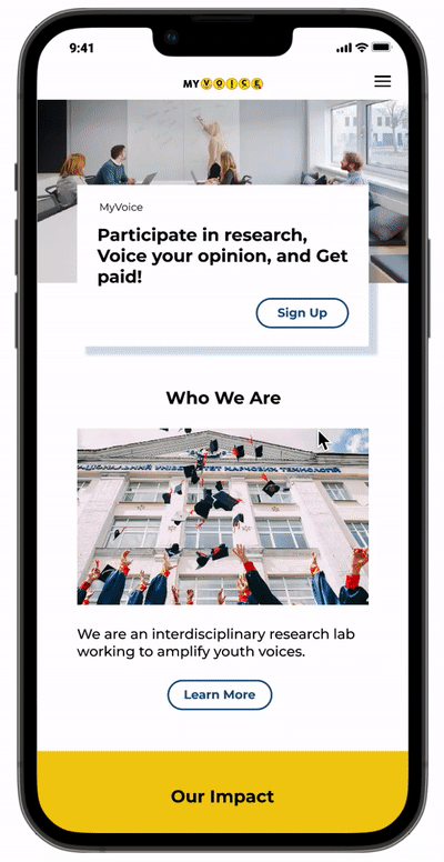 Click to try mobile prototype
Before - Participate
After - Participate
Before - Homepage
After-Homepage
Before you make any user flow or drafts, rethink the users: Who are they exactly? What do they do and what do they need this for? Define users and their goals.
Students and researchers have different goals and different preferences. Students look at the sign-up process and incentives, and the researcher is looking for data and methods.
Pay attention to information hierarchy and organization. Don't make users jump back and forth or get lost. Sort and categorize information along with the user flow.